Project Name— Allied Media Projects Website Redesign
Type— UX Research
Role: Project Manager, UX Reseacher
About this project
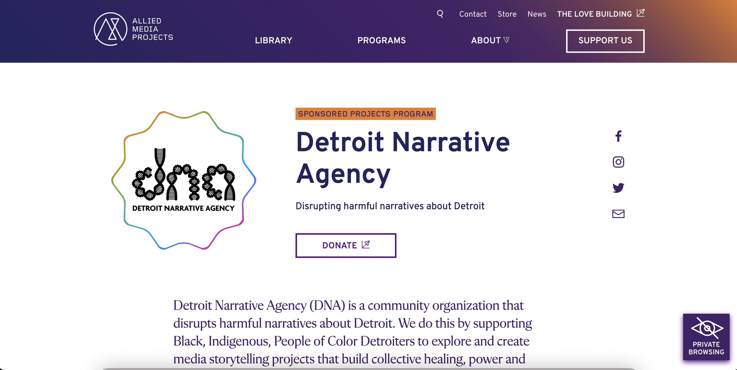
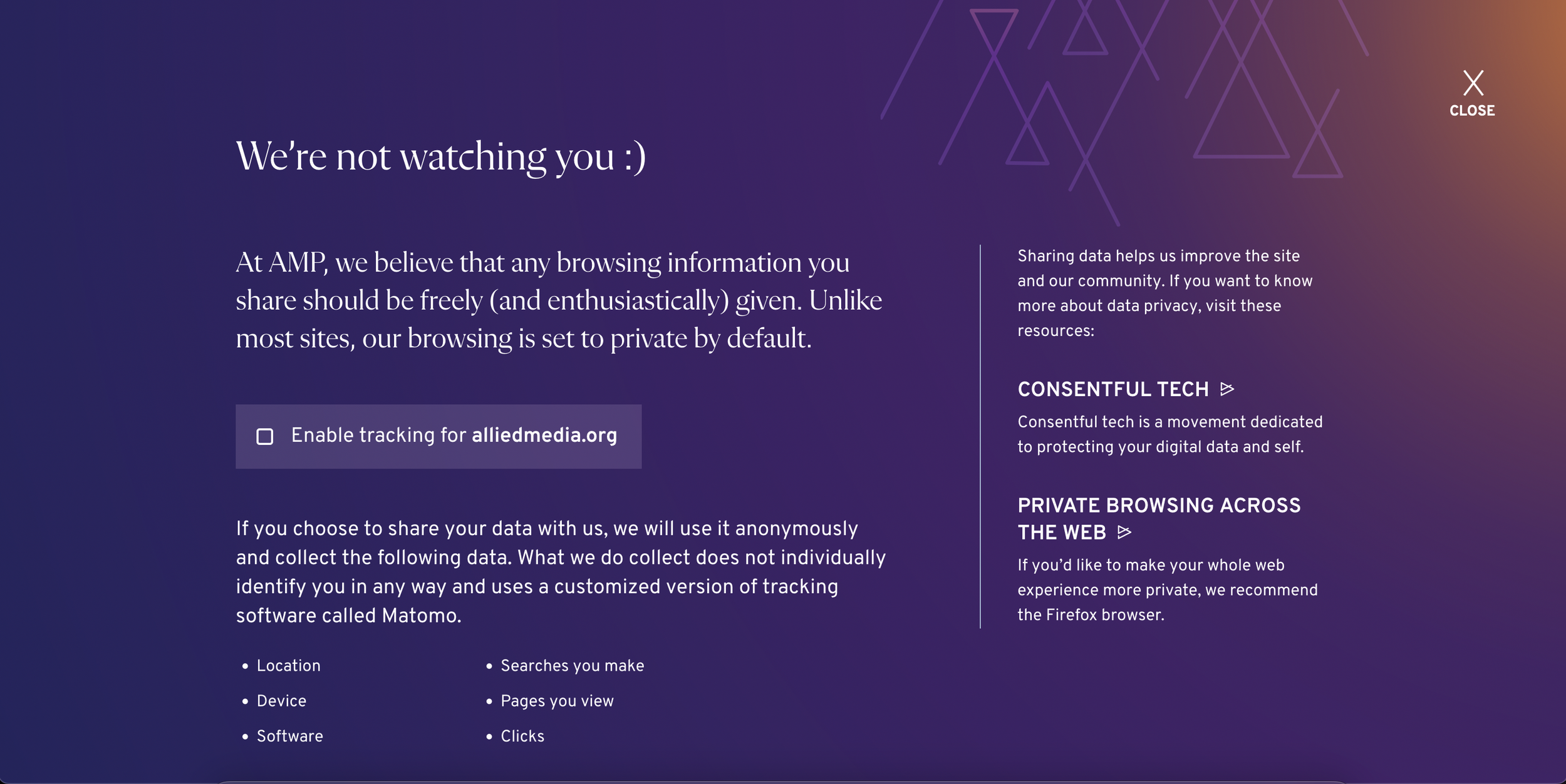
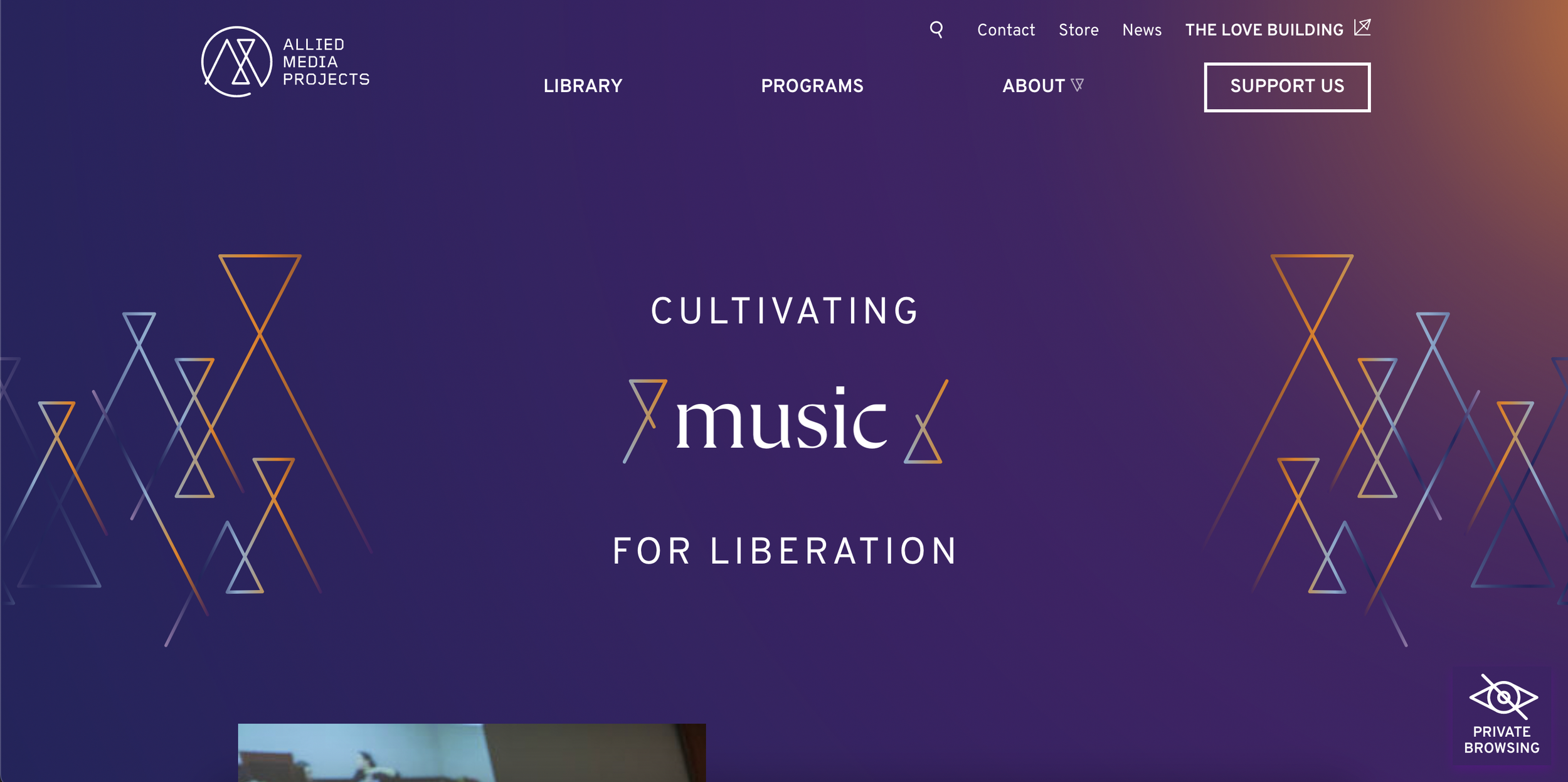
As part of my role as Manager of Technology and Innovation at Allied Media Projects, I drafted an RFP, project managed, and conducted UX Research with design partners at Threespot. The project was under my jurisdiction during partner design firm selection, internal stakeholder engagement, contextual inquiry, and early prototype stage. I turned over the project to our communications department for content migration, but stayed involved conducting usability testing with a range of our users, including disabled users. The result is a webiste with some novel user experiences, including an interface for our users to opt-in to data collection rather than opt-out, aligned with AMP’s commitment to privacy and consentful technology.
Deliverables
For this project, my deliverables were primary processed based. I was in charge of conducting user interviews and co-creating journey maps with stakeholders across the AMP ecosystem. Delierables included: journey maps, personas, user interviews, and insights from usability testing. The final deliverable can be seen live at alliedmedia.org.
Process
The bulk of the work for this project was PM work. I was in charge of leading the DesignOps for the project, orchestrating two independent teams of designers as well as conducting user interviews and collecting usability feedback. My process included exploratory data collection, user observation, and one-on-one usability testing. My main focus was to design with both normative and edge case users in mind, as Allied Media maintains a design justice framework in all the work they do.
Workshop 1:
We recruited 12 participants from AMP’s sponsored projects program, as well as 3 internal stakeholders. As part of this, we held 2 design charettes co-led by Threespot and myself. We began with initial reactions to the overall visual identity, which included a much more angular logo and bright vibrant colors and gradients. We posed questions around how it matched AMP’s energy as an organization, what other organizations or companies the branding reminded them of, and overall how they feel with that brand being their fiscal sponsor. Next, we let them sit down with a Figma prototype of the site and click around to test some of the initial information architecture the Threespot designers had built. One of the key findings was around naming conventions and how each of the 3 program areas were organized and how they folded together to form what would become the programs branch of the IA. Rather than think about 3 separate program areas with different sets of stakeholders, it became clear that a typical stakeholder would interact with all 3 categories of our programs, leading us to design more connecting through-lines between sites and a different type of tag system than the design had initially envisioned.


